
My Work
portfolioCase Study: VeriSource Project Compliance System Redesign
Primary Challenge
An internal project for the Project Compliance System (PCS) team lead who wanted to reorganize the PCS portal and make it more user friendly. The PCS portal, like the rest of VeriSource was built on .Net framework and used Telerik tools that didn't allow for much customization. However, I was brought in to evaluate the screens overall usability and offer alternatives and suggestions to improve the user experience of the portal.

Research
The (PCS) team lead was interviewed to glean functional needs and wish list items. We agreed on scope, and he answered my questions about the content and features he would most like to see in the redesign. I did a usability analysis of the current system and recorded my observations. These observations were shared with both the team lead and senior management. Pain points were uncovered that impacted not just the project set up tasks but the overall usability of the entire application.
Some example observations of critical usability issues included:
- When I go to "New Project from Template" I see a Back button and a disabled "Apply Template" button. It isn't clear what I am supposed to do. I have to click the "Global" expand/collapse link which reveals a list of links. From there, I choose one of the links in the list to make the "Apply Template" button be enabled.
- There are instructions that appear greyed out when this page loads: "Select Work Types and Choose Required Training". I don't see Work Types on page load. This is very confusing.
- Putting instructions inside dropdown menu choices. Example: "Select Work Types And Choose Required Training" is also the label of the dropdown item. At first glance I thought this was strictly instruction and didn't want to click it. Clicking it revealed five more instructions!
Pain Points
Below are screenshots of the current PCS system:
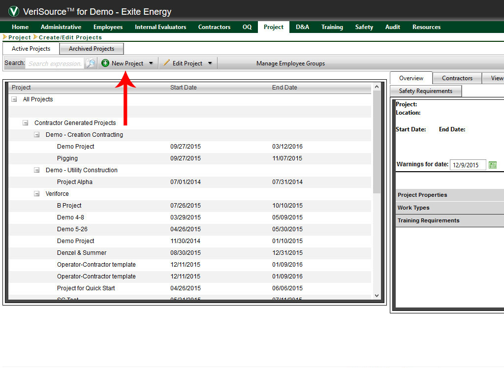
Nearly every key call to action is hidden in a dropdown menu. One of the main observations of the entire application is the over use of dropdown buttons. Often times, there will be less than four or more selections in these dropdowns so there is no need to use this control when selections are seven and less.
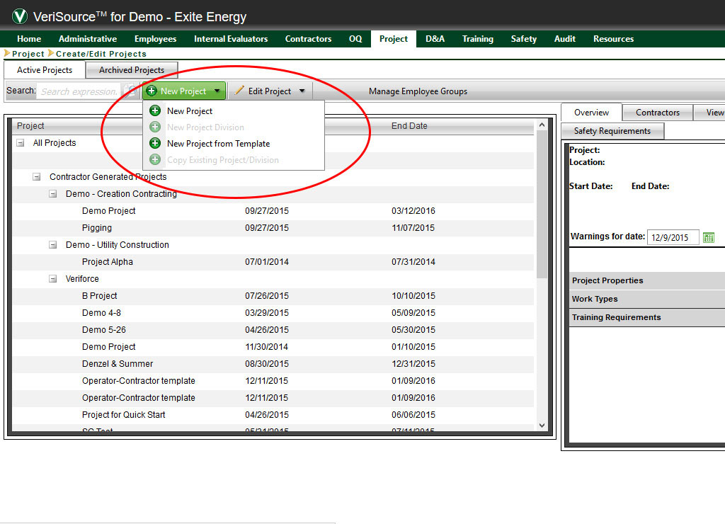
You will notice that once we choose the dropdown button, the user is shown disabled selections they cannot choose with no explanation as to why they can't choose them or why they are there. It is left to the user to figure this out as they start to click buttons.

Once the user clicks to start a new project, a screen opens that takes up the entire browser window. This can be disorienting to the user and not give them a clear sense of where they are in the application.

This screen had many usability challenges:
- Instructions being placed within a dropdown menu along with other choices
- Inconsistent placement of Save and Close buttons
- Bad button labeling like "Save & Go to Inspection Activities "
- Inconsistent use of "and" and "&" in button labels
- Using only color to indicate the update of progress in progress meter. (What about color blind users?)
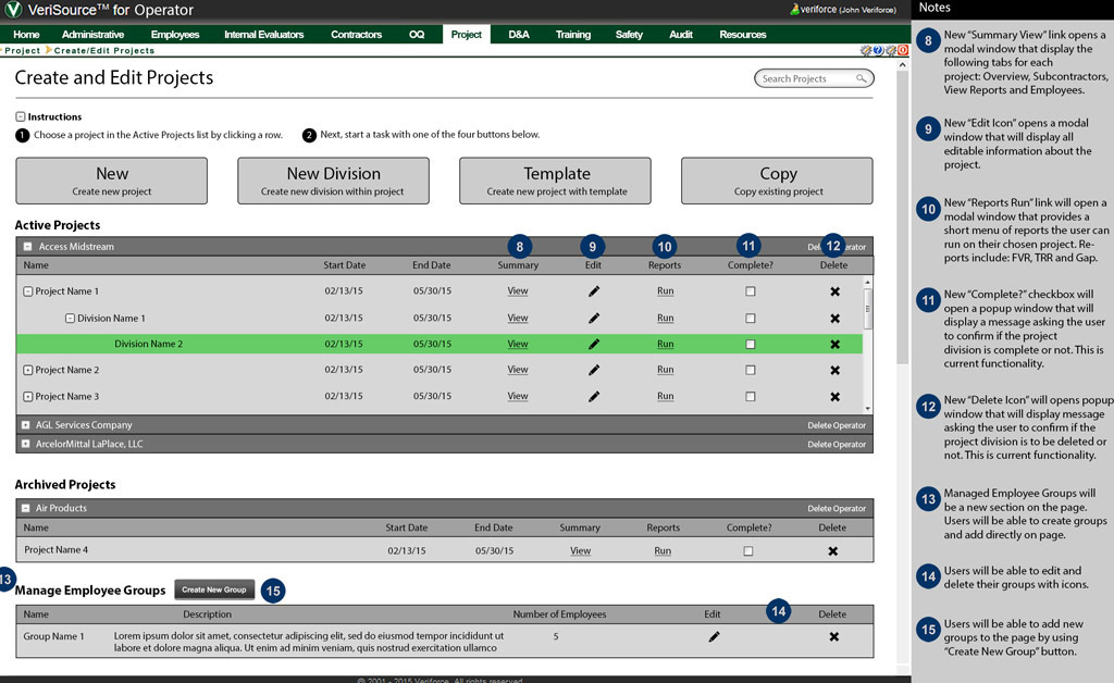
Wireframing
Given the short turnaround (3 days) I did not have time to construct a new information architecture document as is typical with this kind of assignment. Upper management was only interested in how the screens' usability could be improved in their current state so I went directly into wireframing.
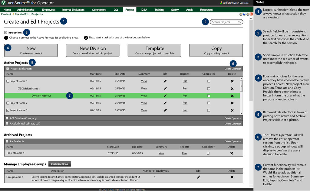
The first idea I had was to bring key functionality to the fore front so users don't have to search to get started on their work flow. This meant limiting the use of dropdown controls. I chose large calls to action to give the user a clear idea of why they are on the page.
The original approach to the interface felt very disjointed. Nearly every screen had a unique look in that button placement was inconsistent, icons meant different things depending on the screen and simple headers letting the user know where they are in the application weren't available.
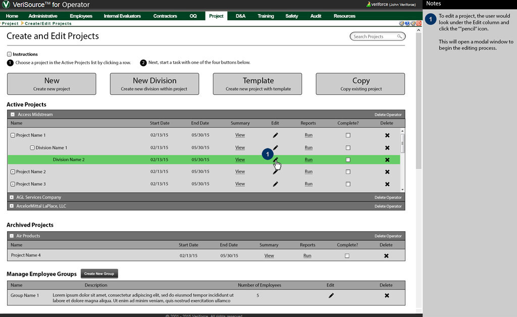
I thought using a pencil icon for an editing rather than a selection in a dropdown would get the user started on their edit work flow faster.

I chose a smaller modal window approach so the user can know they are still on the same screen, just completing a task related to that screen. I chose arrows to indicate the user is following a path to their goal.
There were several wireframes produced for this redesign. Please see this example wireframe to get an idea of my approach.
Outcome
The feedback from management was overwelmingly positive. A discussion with the IT team confirmed that the current technology would not allow many of the changes I suggested. It was decided that a change to an MVC platform over .NET would need to happen before the changes could take place.
A discussion with the project leader let me know I was deliberately held back from the IT team so I would not receive bias as to what could or could not be done with the current technology. They wanted my best ideas without being inhibited. It was a good exercise.
More Case Studies


If you would like to do a project, Let's talk.
Contact with me today for a fast free quote!
get a free quote