
My Work
portfolioCase Study: FBO Upgrade
For the purposes of non-disclosure agreement, the name of this project will be called "FBO Upgrade".
Background
An FBO (fixed-base operator) is an organization granted the right by an airport to operate at the airport and provide aeronautical services such as fueling, hangaring, tie-down and parking, aircraft rental, aircraft maintenance, flight instruction, and similar services. Currently, these FBOs have been using both thirty year old software (TotalFBO) and newer application but difficult to use (Total Aviation Software) to meet the service needs of their customers.
Primary Challenge
Redesign the experience for FBO employees (CSR, Back Office, Operations, Charter and Maintenance) daily workflows. We need to observe the tools they use and understand the constraints encountered, the workarounds created, and the pain points they experience.

Research
Interviews
We used onsite ethnographic usability research to observe different user types in their work environment. We also used remote one-on-one interviews and contextual inquiries to quickly obtain data. During these sessions, participants discussed their FBO processes, tasks, and experiences in 90-minute sessions. Audio was recorded onsite using an app. Video of screen sharing was captured for the remote sessions via WebEx.
Competitors
The usability findings for both TFBO and TAS were generally initially difficult to learn and there were issues completing tasks due to lack of customization.
Some example observations of critical usability issues included:
- UI is “outdated,” and not intuitive.
- Functionality is hidden:
- Users feel and know they have additional options in the software.
- But they don’t know what, or how to access it without “playing around with it for a while."
- Executing basic daily tasks requires several clicks:
- Extra clicks add time to the user’s workflow, such as running reports and concierge tasks.
- Buttons and Calls-to-Action (CTAs):
- Titles are confusing, need to be “tried out” to learn what they’re for. Users have to rely on recall over recognition (which needs to be reversed).
- Multiple paths to complete the same task.
- Frustration with inconsistency of CTA placement, and titles, such as ‘Okay’ and ‘Cancel.’
- Icon placement, and look and feel inconsistent
Overall Recommendations
- Consider implementing an aggregated, customizable dashboard unique to the different user roles.
- Modern UI and responsive design that takes advantage of a device’s native features (responsive design).
- Simplify workflows [ that take more than three or four clicks ] where possible.
- Include real-time maps of an FBO’s ramps, hangars, and trucks placement and loads. Communicate clearly to users if there are connectivity issues.
- Hangar and ramp reservations and management tools.
- Customizable color coding and iconography for flight statuses (Arrivals, Departures, and Delays).
- Color and icon changes for completion of jobs or service tasks and invoicing status. Consistently pairing icons and colors will assist users with environmental factors or vision impairment.
- Customizable show/hide option for modules, where applicable.
- One workflow for a task set to decrease confusion, and redundancy across product.
- Consistent use of asterisks (*) to denote what fields are required to complete a task, as well as real-time inline validation, which will aid in faster and successful workflow completion.
- Reduce a user’s need to tab between screens to compete a task.
- Do not hide pertinent or important data or options. Display any sub navigation options in dropdown menus, for manageability and scan-ability.
Our Design Process
This was a very large project that included five User Experience Designers, two Front-end Developers and nearly twenty Back-end Developers. As a UX designer on the project, I conducted research, created user personas, visualized the user’s journey, designed low to high-fidelity wireframes, and user tested the prototypes.
Each Functional Area's sprint consisted of a kick-off meeting with the Product Owner. We begin all kick off meetings with product managers, designers and developers. This gives the developers an early look at project expectations and potential challenges. The design sprints consisted of 5 phases executed using agile methodology: 1) Research 2) Plan 3) Design 4) Test 5) Iterate
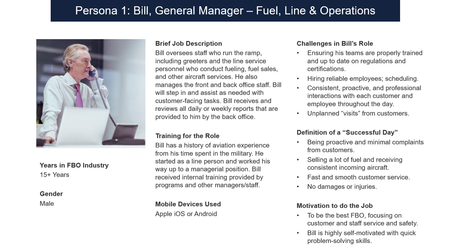
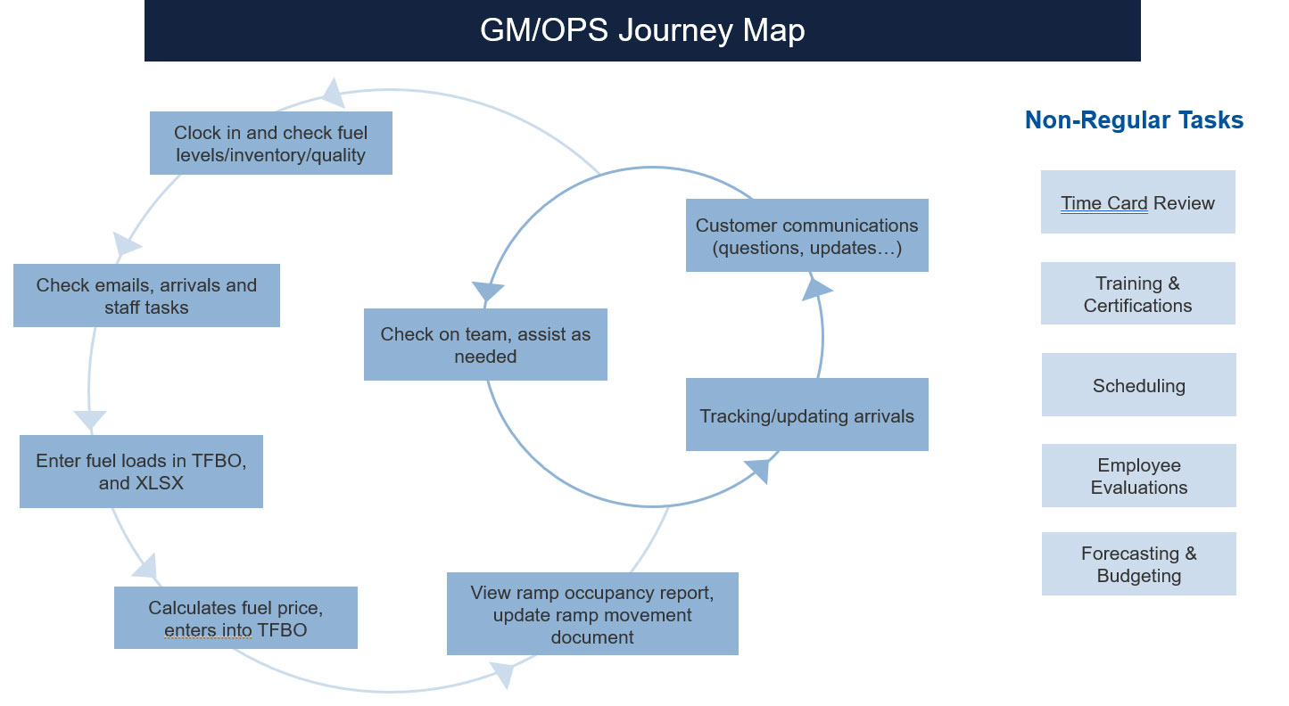
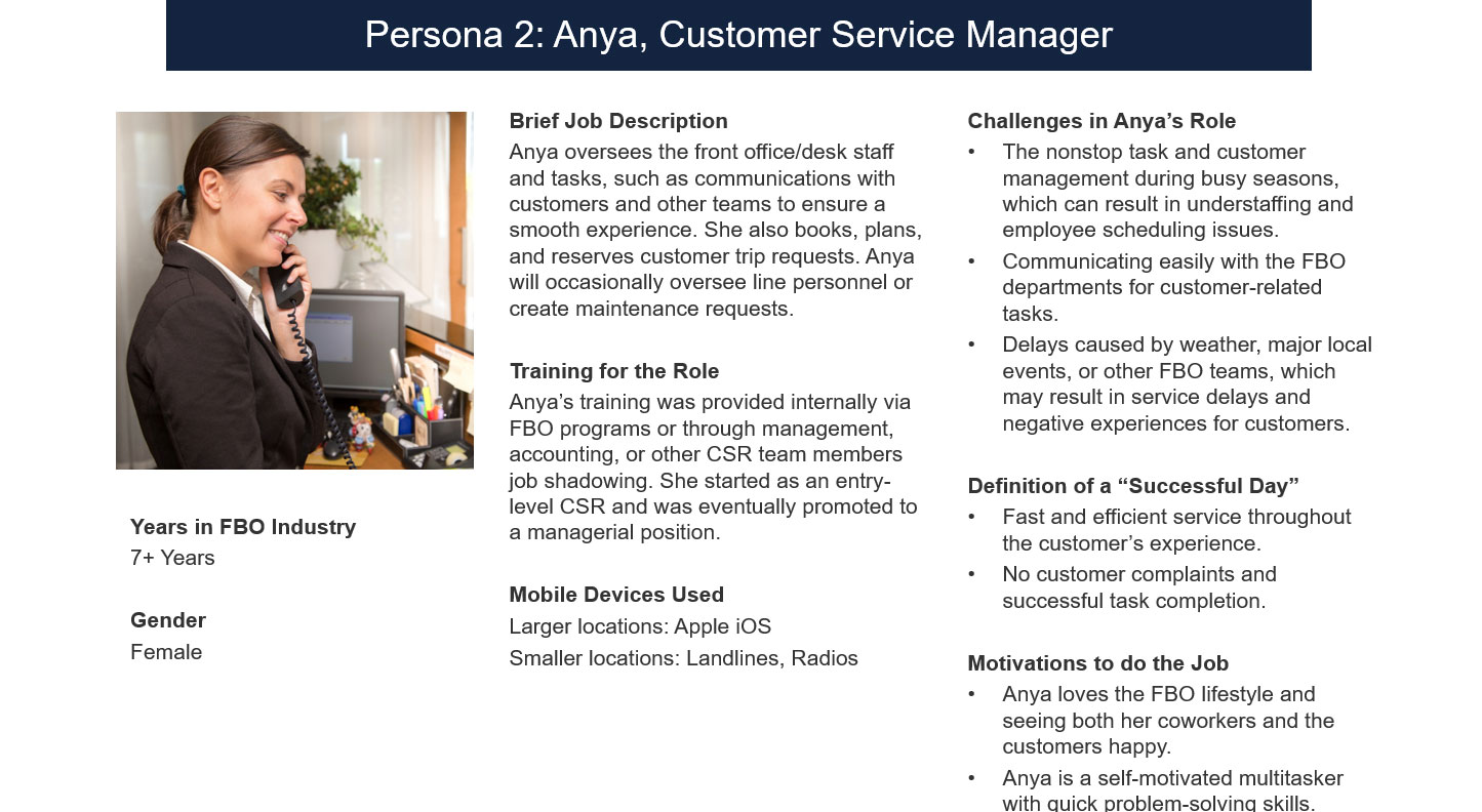
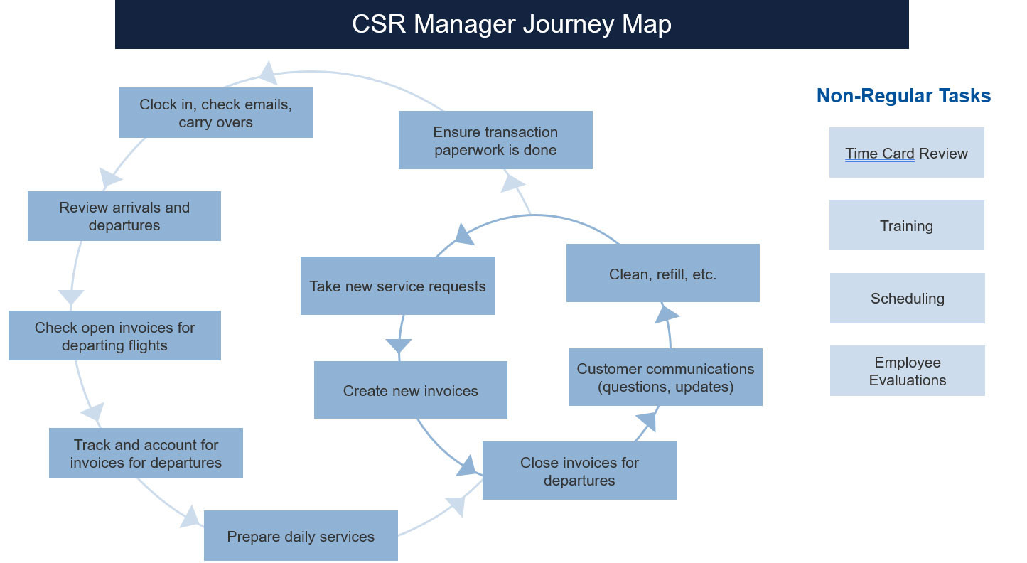
Persona and User Stories Examples
To compile and visualize our user research, we created a diagram from our participants’ responses.

From this diagram, we devised personas and wrote accompanying user stories that would represent FBO Upgrades target user base.
These personas and user stories guided us throughout our design process to ensure that we design for our target user’s specific goals and needs. Below are a few examples:
My Role
I was assigned specific Functional Areas of the application that included: Customer Profile, Aircraft Profile, FBO Employee Profile, Fuel Management and Liveboard. I am currently updating this section with my deliverables from each area. Please see below:
View Customer Profile
View Fuel Management -- Coming Soon
View Aircraft Profile -- Coming Soon
View FBO Employee Profile -- Coming Soon
View Liveboard-- Coming Soon
Outcome
This project was definitely a challenge but a very rewarding one. Our prototypes met the needs of our user personas by being simple, trustworthy, informative, and intuitive. We have had an overwhelmingly positive response from the FBOs we user tested and addressed many of the major pain points of the competitors applications. We partnered with an FBO to beta test before the initial release but the project unfortunately has been put on hold due to the pandemic.
More Case Studies


If you would like to do a project, Let's talk.
Contact with me today for a fast free quote!
get a free quote