
My Work
portfolioCase Study: Customer Profile

Pain Points
- Several users desired customer profile and fuel information on same page to quickly perform their customer facing tasks.
- Customer requests taken by paper forms, phone calls, or via email don’t always make it to an online profile.
- In TFBO, a Back Office user noted once they set up a customer profile then go back to their email to send a confirmation.
- Inability to pre-populate concierge screens with customer notes, resulting in users manually entering data for every instance.
Planning
After conducting extensive research, we dove into the planning stage of our design sprint. We compared customer profile data between the competitors and simplified which features are consistent and make them more intuitive.
Feature Prioritization
Before we jumped into designing any screens, we wanted to nail down the key features within the app that would meet the needs of our users. We brainstormed features and prioritized the most important ones. We knew we needed a Create screen for the customer profile as well as a Detail screen once the created profile was saved. Key features included:
- Customer Details
- Primary Account Contact
- Billing Address
- Mailing Address
- Aircraft Details
- Reward Loyalty Programs
- Related Contacts
Feature Brainstorm
User Flows
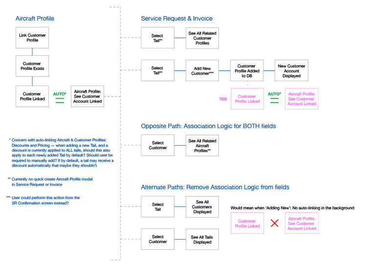
We knew the customer profile had a direct connection with the aircraft profile and the service request. We created user flows to help us visually map out and sequence the steps our users would take between customer profile, aircraft profile and the service request.
Design
Sketching
Finally reaching the design stage of our project, I began rough sketching layout ideas of the profile. I considered a tab interface that focused on a general overview of the customer profile on the first tab, adding crew members associated with the profile on a second tab and associated aircraft to the customer profile on the third tab.
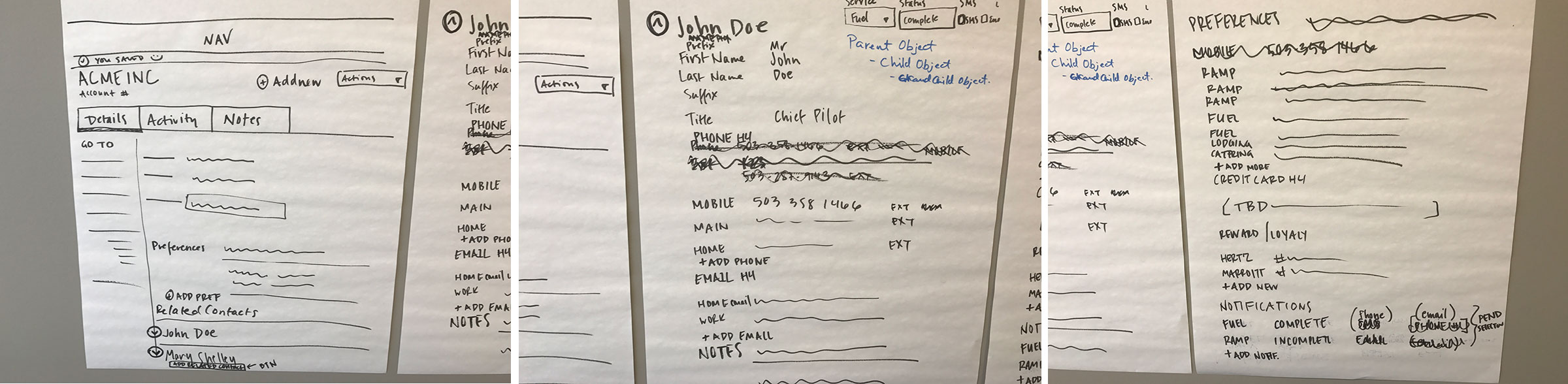
Low-Fis and Mid-Fis
The design went through several iterations. We eventually decided to have a fixed left side navigation that when clicked, would scroll the user to that particular section. Below are low fidelity screenshots of the evolving interface.
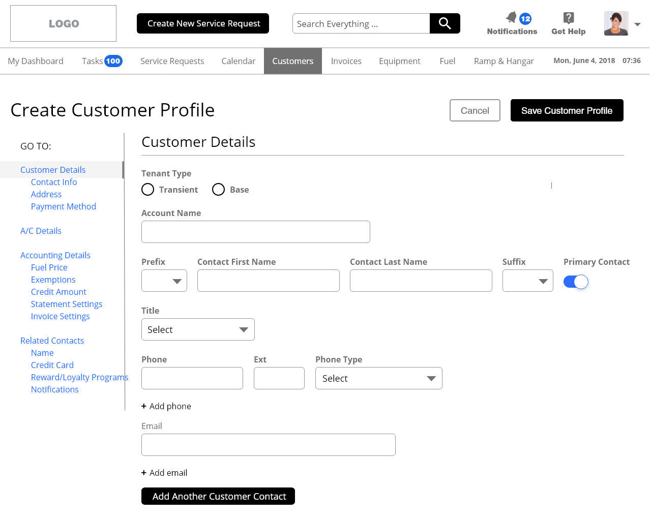
The Create screen would be where CSRs enter new customer information. This includes Customer Account Name and Primary Account Contact.
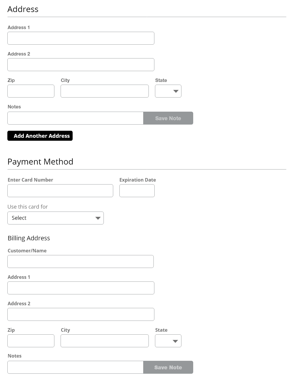
Users could enter multiple addresses for a customer. In the earliest iterations, Payment Method was included but would later be moved to a different section based on development complexity.
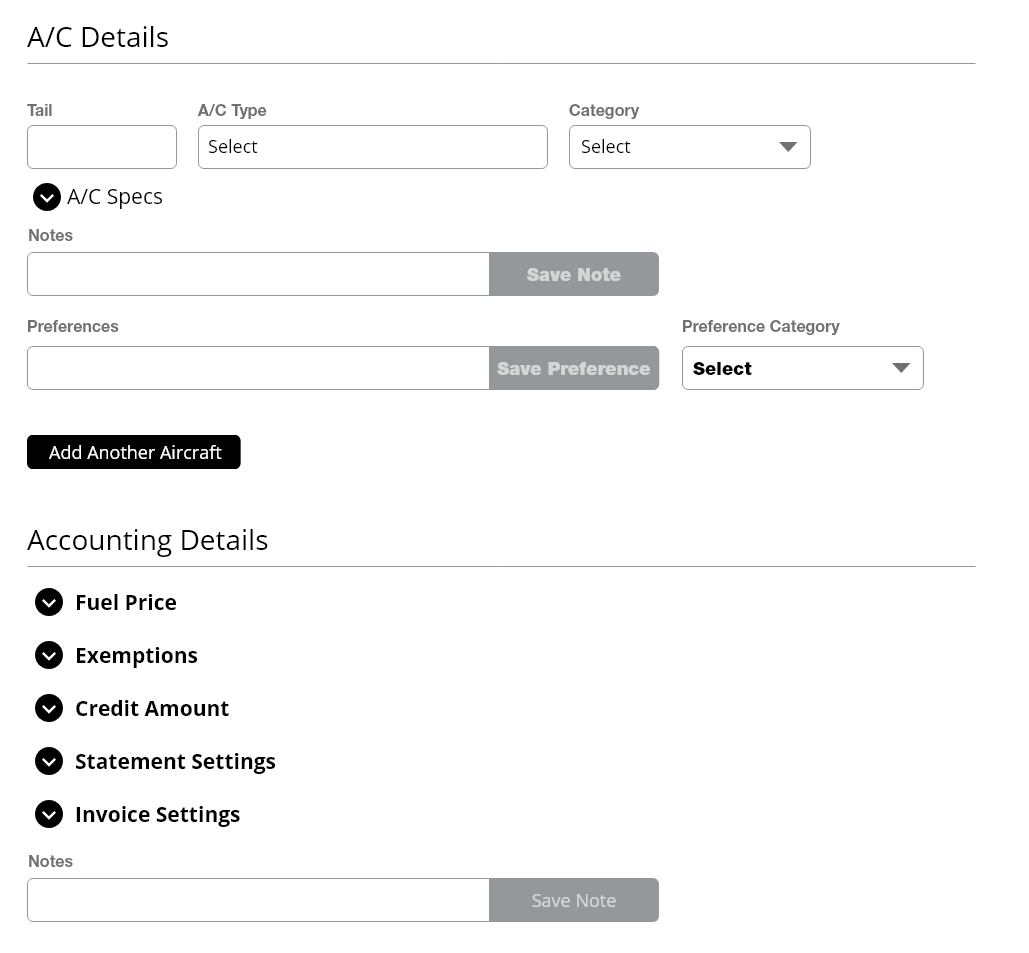
Associating Aircraft details was included but would be reworked in later iterations. Accounting Details was initially going to be several expand/collapse panels allowing users to enter fuel pricing, assign exemptions, credit amounts and set settings for how customers receive invoices and statements. This too had to be moved to the Customer Details screen based on complexity.
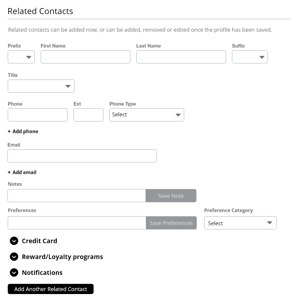
Finally, users could add related customer contacts. These contacts would have credit cards added, reward/loyalty program memeberships and eventually notification settings.
Prototyping
Once we had a good idea of the general layout of the customer profile, I built a prototype to present to our product owner and developers. This prototype was built in Axure. The prototype helped to visually explain functionality but was effective with rapid iterations.
Annotated Wireframes
We then created annotated wireframes based on our low fidelity designs to explain every feature to our product owner and developer team. These annotations were created in Indesign. This helped us create open discussions with the team to clarify issues, answer questions an gain acceptance on design decisions.
Design Decisions
Original Design
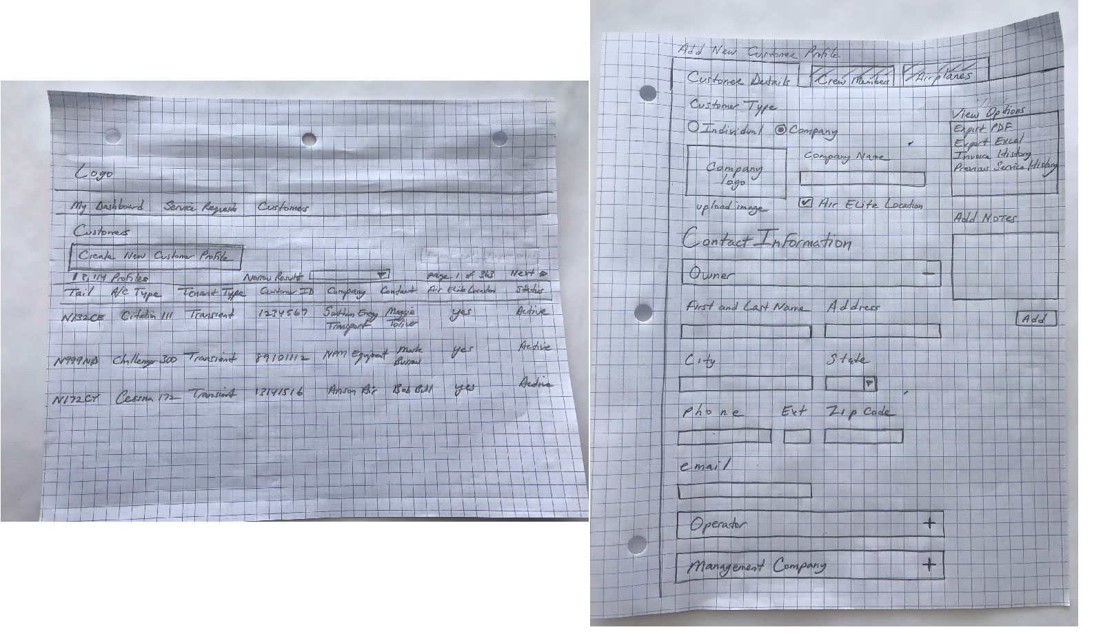
In the original customer profile for Total Aviation Software (TAS), the customer profile page showed the following: Company Name, phone and email. For an individual, they captured first and last name, phone email and notes.
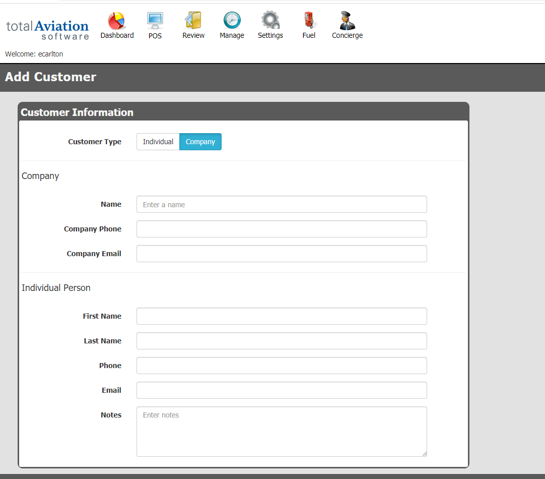
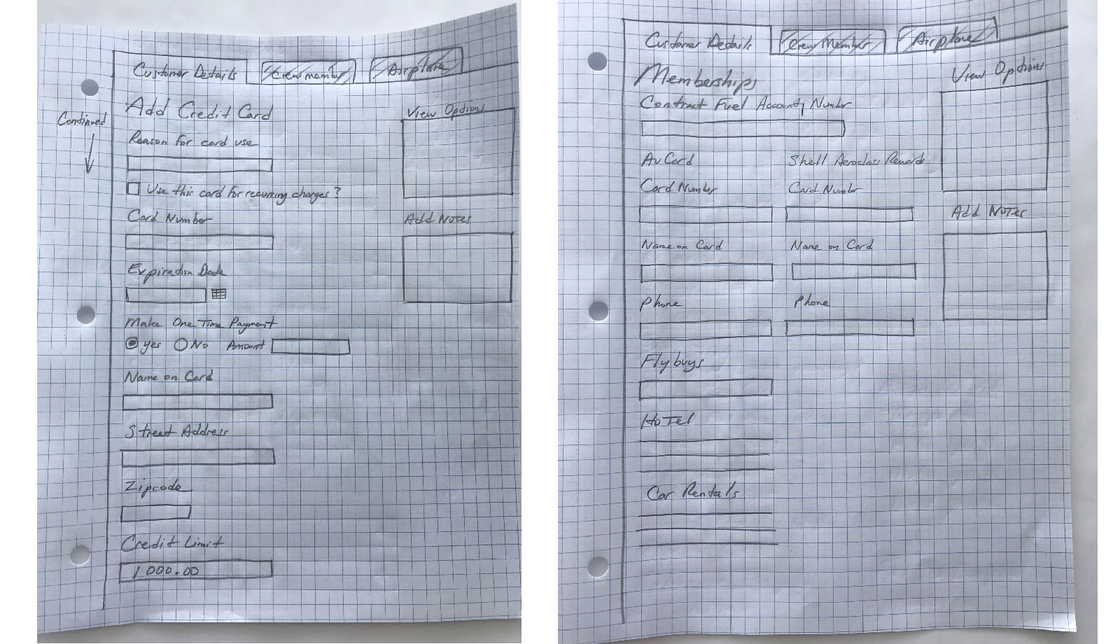
Once user completed this data, they had to save and then be taken to a more data heavy screen with many expand collapse panels. See below:
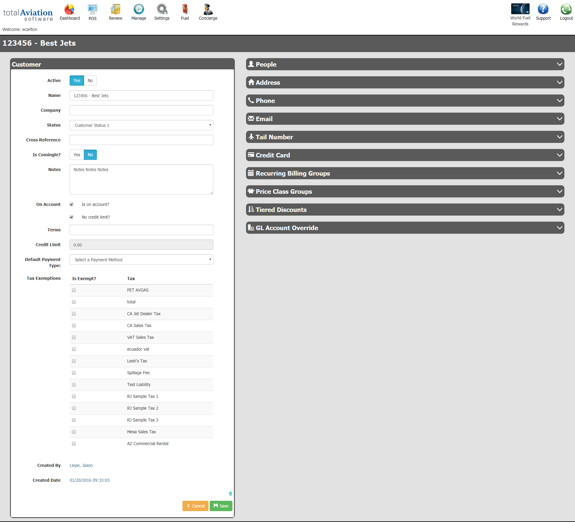
This screen does not group like categories or give helpful tips to the user on how to complete certain sections. There doesn't seem to be a flow to the interface other than to just fill things out. Also the user can't tell what sections are required or optional until they click Save and receives an error message stating certain sections are required. Finally, other sections are hidden in expand/collapse containers. Once open, the user has to go to separate screens to complete the form.
New High-Fi Design
There were several rounds of UI design based on updated branding guidelines. The finalized designs were created in Adobe XD complete with specifications and css code for the developers to implement. Please view some sample screenshots of the final customer profile designs:
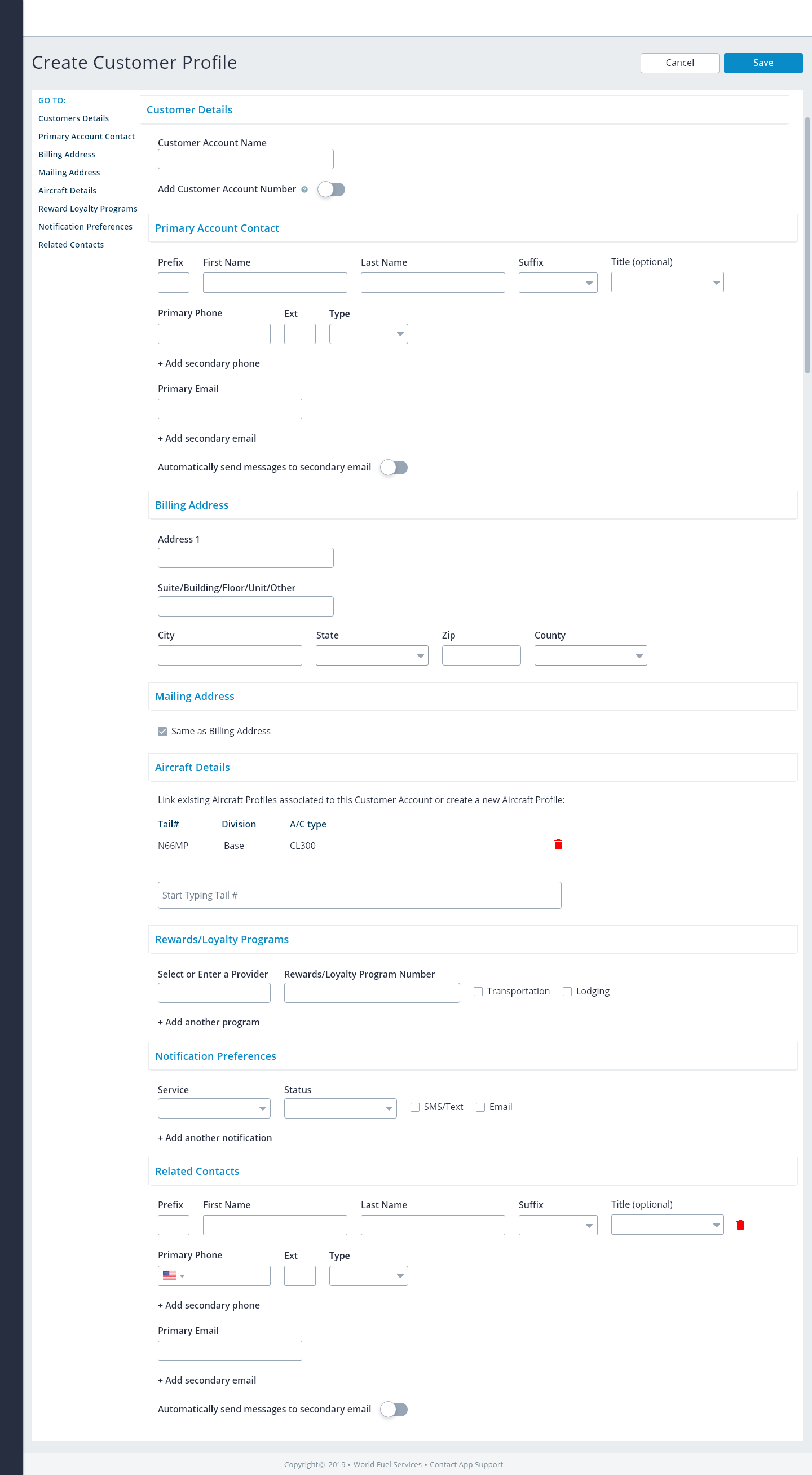
The final Create screen. We removed the Accounting Details and placed them on the Details screen. The reason for this is the Accounting Details section is role based. Only certain roles will have access to this so keeping it on the Create screen would make us disable sections. The idea is to allow users to use what they need, not disable what they don't.
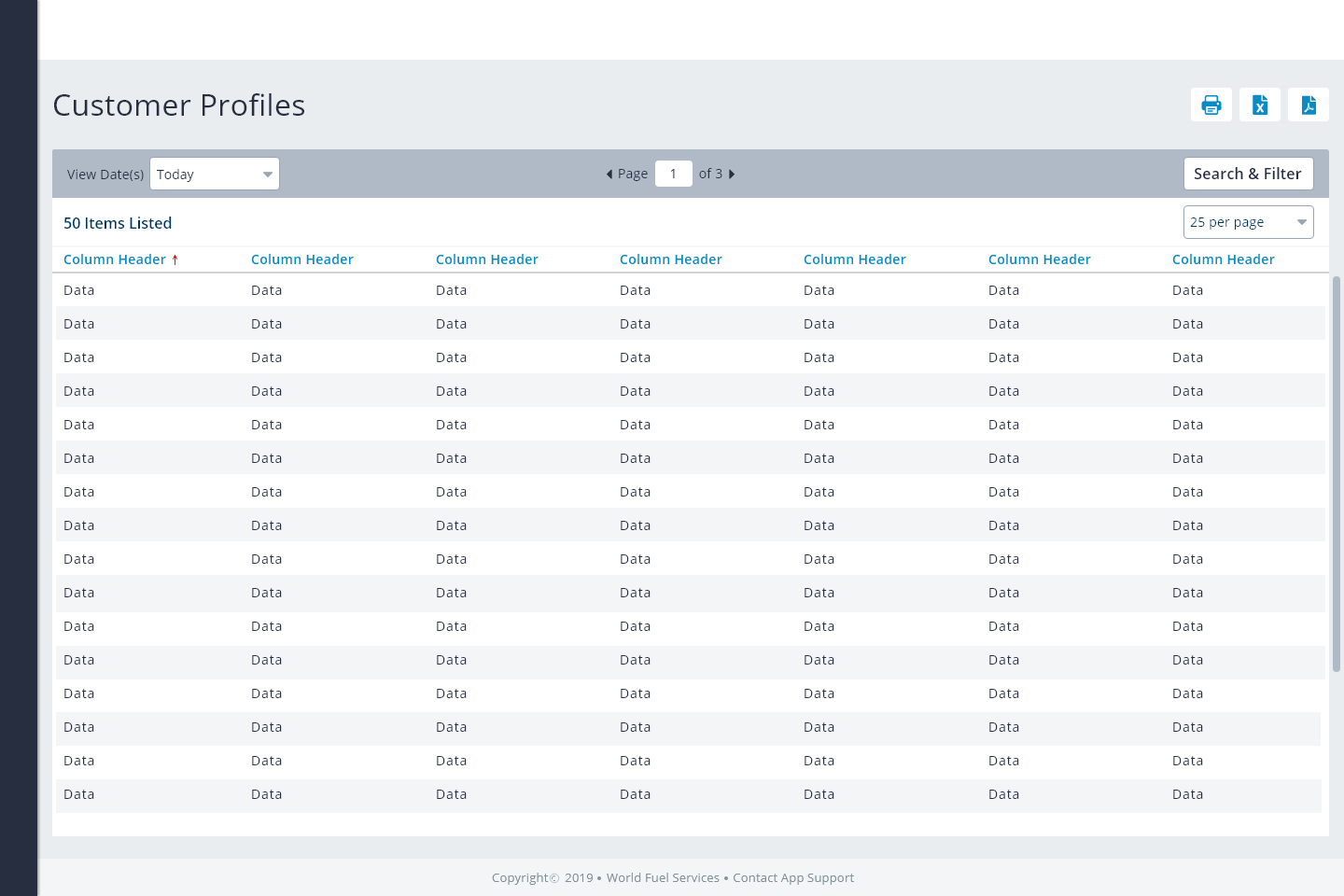
The final List View screen. This example shows a grid view of a list of customer profiles once they have been created and saved. Here users can not only see the number of customer profiles, but select and modify profiles as needed. Users can use specific search criteria to filter the profiles by date, name etc..
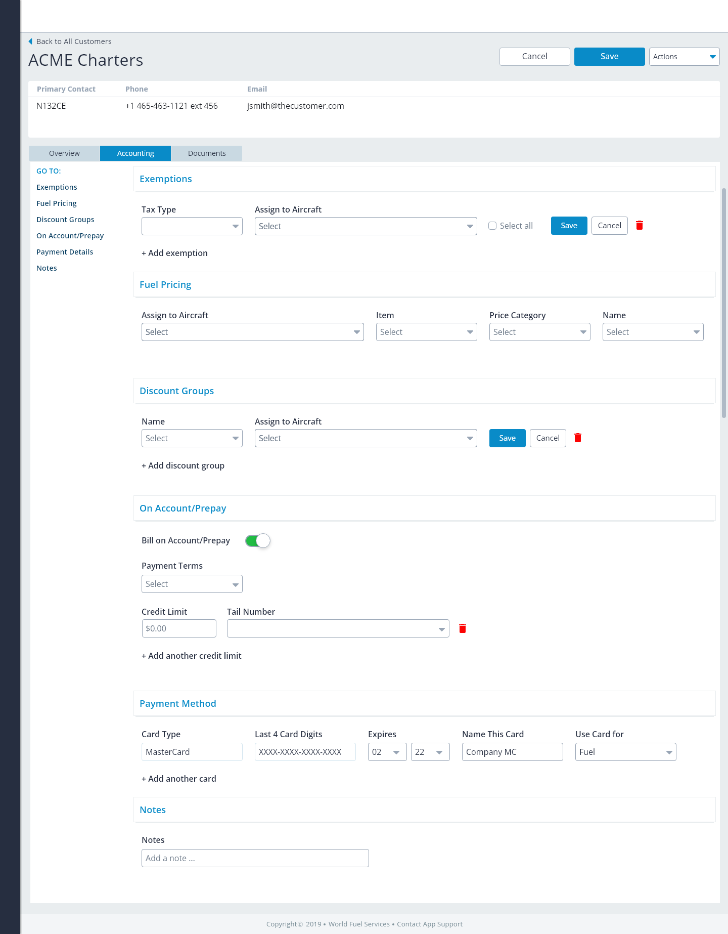
The final Detail screen. Users can modify saved customer profiles. We used a tab interface to address complex role-based sections like Accounting Details. Here, users can add credit cards, apply exemptions, assign discounts and credit limits to a customer profile.
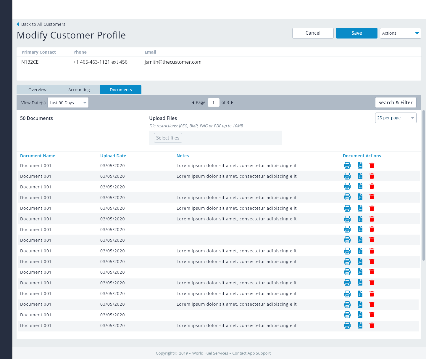
The final Documents screen. Users can upload important documents to be associated with the customer profile.
Outcome
We addressed several pain points stated earlier including being able to add special notes to a customer account, making the process of associating aircraft to a customer account easier as well improving the process of adding related contacts to a customer account.
More Case Studies


If you would like to do a project, Let's talk.
Contact with me today for a fast free quote!
get a free quote